
Introduction: The Psychology Behind Visual Impact
In the world of business branding, color isn’t just decoration — it’s communication. From the moment a potential customer sees your sign, color triggers emotional responses and perceptions that can make or break a first impression.
Whether bold and energetic or calm and refined, the right color palette helps businesses stand out, attract attention, and reinforce brand identity. In signage design, color plays a vital role not only in aesthetics but also in psychology, readability, and marketing effectiveness.
Let’s dive into how color influences business signage and how you can use it strategically to elevate your brand’s presence.
1. Color as a Branding Tool
Every major brand in the world — from Coca-Cola’s bold red to Starbucks’ earthy green — uses color as a defining element of its identity. The same principle applies to your business sign.
Color conveys emotion, tone, and purpose before a single word is read. A study by the Institute for Color Research found that up to 90% of snap judgments about products or brands are based on color alone.
For example:
- Red symbolizes passion, energy, and action — ideal for restaurants and retail.
- Blue evokes trust, professionalism, and calm — common in corporate and healthcare settings.
- Green represents growth, health, and sustainability — perfect for eco-conscious brands.
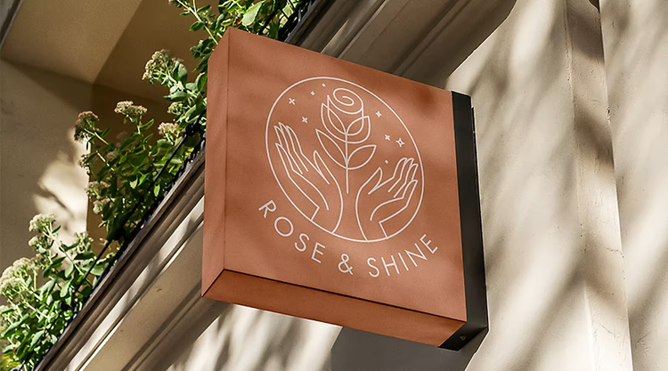
- Black and gold project luxury and exclusivity — favored by high-end businesses.
Choosing the right color ensures your sign aligns perfectly with your brand personality and target audience.
2. Enhancing Visibility and Readability
The most beautiful sign in the world won’t work if people can’t read it. That’s why color contrast is critical in signage design.
High-contrast color combinations — such as white text on dark backgrounds or black text on light backgrounds — improve legibility from a distance and under varying lighting conditions.
Here’s a quick guide to effective color contrast:
- Light background + dark letters: Ideal for large outdoor signs.
- Dark background + light letters: Works well for illuminated or indoor signage.
- Avoid low contrast: Similar hues (like red on orange) reduce visibility.
Good contrast isn’t just a design choice — it’s a functionality requirement that ensures your sign performs effectively day and night.
3. Emotional and Psychological Influence
Color is one of the most powerful emotional triggers in visual marketing. It can influence customer behavior, mood, and perception of quality.
For example:
- Red and yellow increase appetite and urgency — often used in the food industry.
- Blue and gray inspire confidence and reliability — common in finance and law.
- Purple signifies creativity and sophistication — perfect for salons or boutique brands.
- Orange communicates friendliness and enthusiasm — great for startups and entertainment venues.
By understanding these associations, businesses can use color strategically to influence how customers feel and react when encountering their brand signage.
4. Consistency Across All Brand Touchpoints
Consistency builds trust. Your sign colors should match your logo, website, uniforms, and marketing materials. This creates a seamless experience that reinforces recognition and credibility.
When all brand elements align visually, customers are more likely to remember your business and associate it with professionalism and reliability.
This is especially important for multi-location businesses, where consistent signage color schemes unify the brand identity across different sites.
5. Material and Lighting Considerations
The appearance of color can change depending on materials and lighting. For example, matte finishes may appear muted under natural light, while glossy or metallic finishes reflect more brightness.
LED illumination can also alter how color appears at night. Testing your color combinations under both daylight and artificial light ensures your sign looks vibrant and professional in every condition.
High-quality sign manufacturers take these factors into account during production to ensure visual consistency and durability.
6. Customization for Maximum Impact
Choosing the right colors for your business sign isn’t a one-size-fits-all decision. Customization allows you to combine brand psychology, local environment, and aesthetic appeal into a unique visual identity.
Companies that specialize in custom business signs work closely with clients to select color palettes that enhance visibility and align with brand goals. By combining design expertise with material innovation, they create signage that captures attention, communicates purpose, and leaves a lasting impression.
Conclusion: The Art and Science of Color in Signage
Color isn’t just a design detail — it’s a strategic branding tool that influences perception, visibility, and emotional connection. When used effectively, it transforms ordinary signage into an unforgettable visual statement.
From attracting new customers to strengthening brand identity, the right color choices make your sign work harder for your business — day and night.


